

Treasury Wine Estates has unveiled plans to launch a new brand identity for Lindeman’s.
With a new logo and packaging, the brand will be more recognisable to consumers whilst still differentiating between different ranges within the brand.
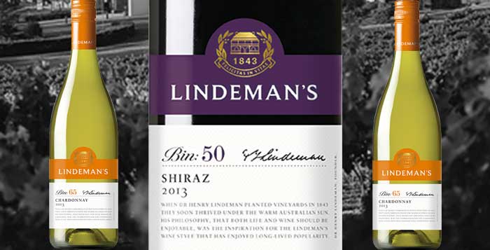
All labels will be modernised to make them easily identifiable on shelf for shoppers and the colours of the Bin Series tier have been updated to a more vibrant and appealing colour palette.
The iconic Lindeman’s wreath has been updated to feature Australian native plants eucalyptus and gum nuts, reflecting the brand’s home. The new logo aims to acknowledge the role of Dr Henry Lindeman in founding the brand in the Hunter Valley in 1843.
Matthew Bird, marketing director at Treasury Wine Estates said: “The fresh new brand identity and look for Lindeman’s will deliver greater standout on shelf with clearer and more impactful packaging, making it easier to spot for shoppers which will ultimately drive more sales for retailers when it arrives in store
next year.”
Visit the Lindeman’s website to see a timeline of its history
Comments
This article doesn't have any comments yet, be the first!