

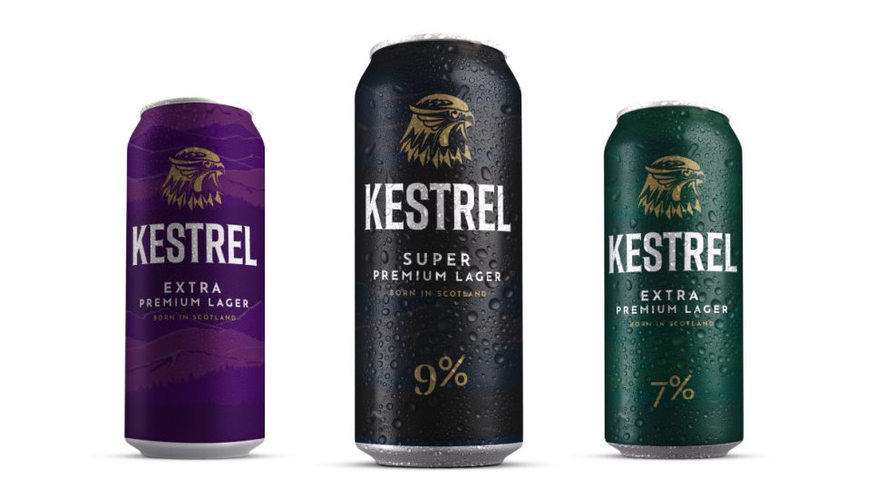
High-strength lager Kestrel Super Premium has undergone a packaging redesign to modernise the brand and appeal to a wider audience, according to its UK distributor Brookfield Drinks.
The updated branding features a “clean” design with a modernised typeface and minimalist appearance.
It retains the brand’s black and gold colourways, but makes the Kestrel head logo more prominent with the removal of the traditional roundel design.
Additionally, Kestrel Extra Premium and Kestrel Premium have also been rebranded.
Strongbow to launch Tropical variety alongside updated pack design
Nigel McNally, managing director of Brookfield Drinks, said updating the packaging was the “last piece of the jigsaw” for the brand, following a focus on premiumisation through using a natural water source and winning various awards.
“Kestrel Super Premium lager is the bestselling independently owned canned lager brand and is seen as a must-stock for independent retailers’ beer, wine and spirits range,” he said.
“We are seeing more consumers enjoying higher-ABV beers which are full of flavour. There are lots of people who choose to have only have one or two glasses of a stronger beer, as they don’t want to drink a large volume of liquid.”
Kestrel plans to build on the rebrand with depot initiatives, endorsements by Scotland’s national chef Gary Maclean, social media, and ongoing sponsorship of drag racing venue Santa Pod Raceway.
Read more alcohol product news and category advice
Comments
This article doesn't have any comments yet, be the first!